
GUIDING THE FLOCK: NAVBAR AND LANDING PAGE REDESIGN
GUIDING THE FLOCK: NAVBAR AND LANDING PAGE REDESIGN
SOUTHERN WISCONSIN BIRDS ALLIANCE
SOUTHERN WISCONSIN BIRDS ALLIANCE
Our award–winning solution for the Badgers For Good Design-a-thon
Our award–winning solution for the Badgers For Good Design-a-thon
In under 6 hours, our 3-person team researched pain points, ideated solutions, iterated, and developed a high-fidelity prototype for the Southern Wisconsin Bird Alliance's "Birds" tab.
In under 6 hours, our 3-person team researched pain points, ideated solutions, iterated, and developed a high-fidelity prototype for the Southern Wisconsin Bird Alliance's "Birds" tab.
THE PROBLEM
THE PROBLEM
An issue rooted in informational architecture
An issue rooted in informational architecture
Since the organization's beginnings, the website had grown to house a variety of valuable content. Navigation, however, became difficult and confusing.
This quickly proved to be much more than just updating the navigation bar. The underlying challenge was reorganizing, condensing, and relabeling content to be intuitive for both staff and general community members.
RESEARCH
RESEARCH
Identifying major pain points
Identifying major pain points
We put ourselves into the shoes of the general audience browsing the site, individually identifying the biggest usability issues.
We put ourselves into the shoes of the general audience browsing the site, individually identifying the biggest usability issues.
1
1
Overloaded navigation
Overloaded navigation
Too much content is competing in one place.
Too much content is competing in one place.
2
2
No unified landing page
No unified landing page
Clicking the Birds tab leads to the first nav item.
Clicking the Birds tab leads to the first nav item.
3
3
Unclear labels and categories
Unclear labels and categories
Menu headers do not always match expectations.
Menu headers do not always match expectations.
4
4
Text-heavy experience
Text-heavy experience
Some pages are harder to scan for relevant information.
Some pages are harder to scan for relevant information.
THE SOLUTION
THE SOLUTION
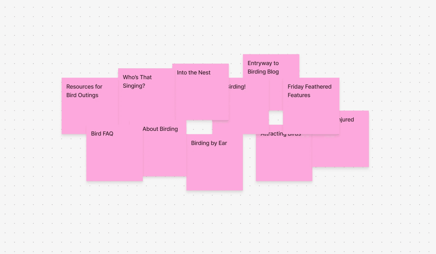
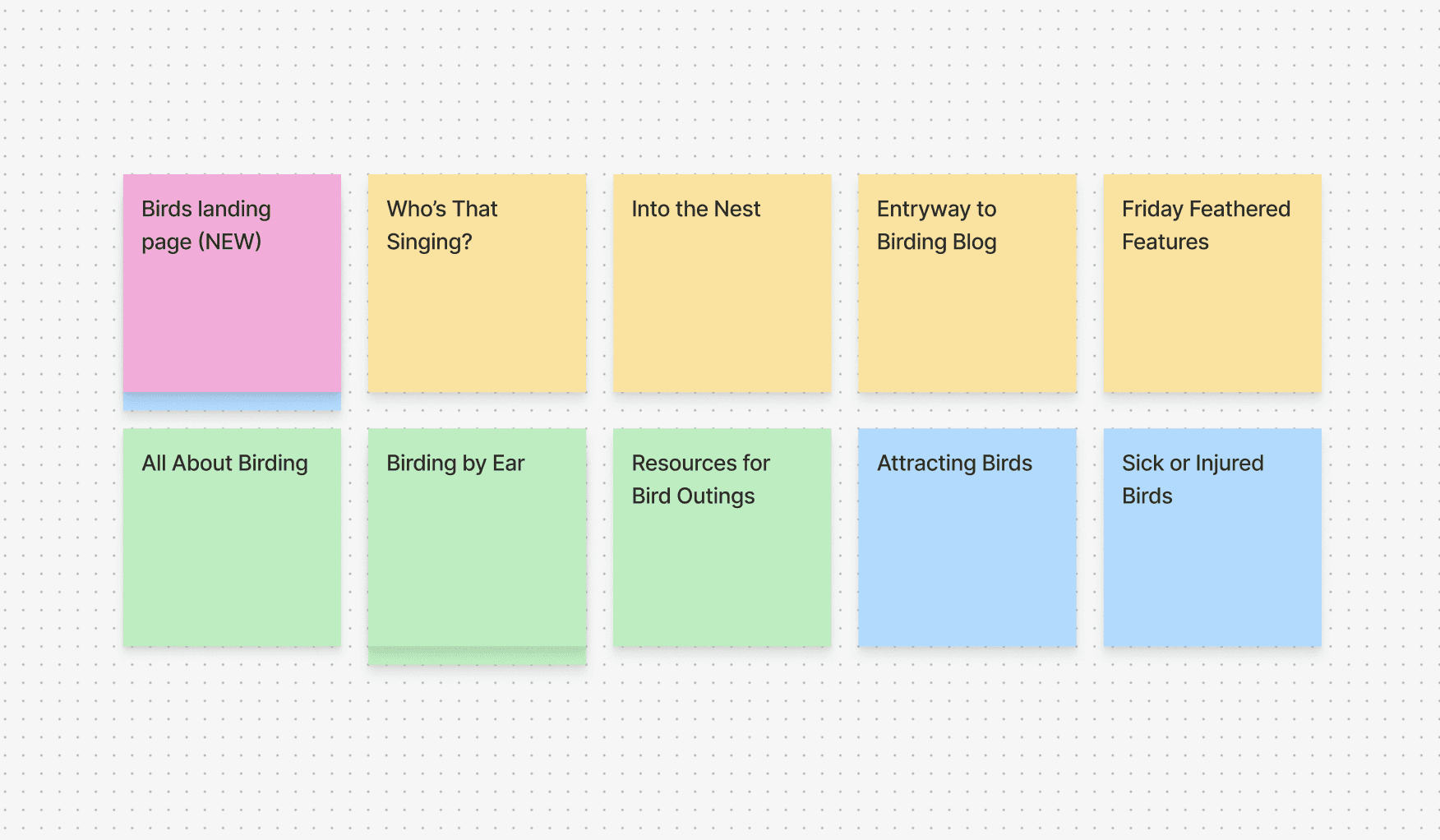
A simple but effective card sort
A simple but effective card sort
Card sorting helped reveal how users naturally group and label content, making it a useful tool for rethinking the Birds section’s information architecture.
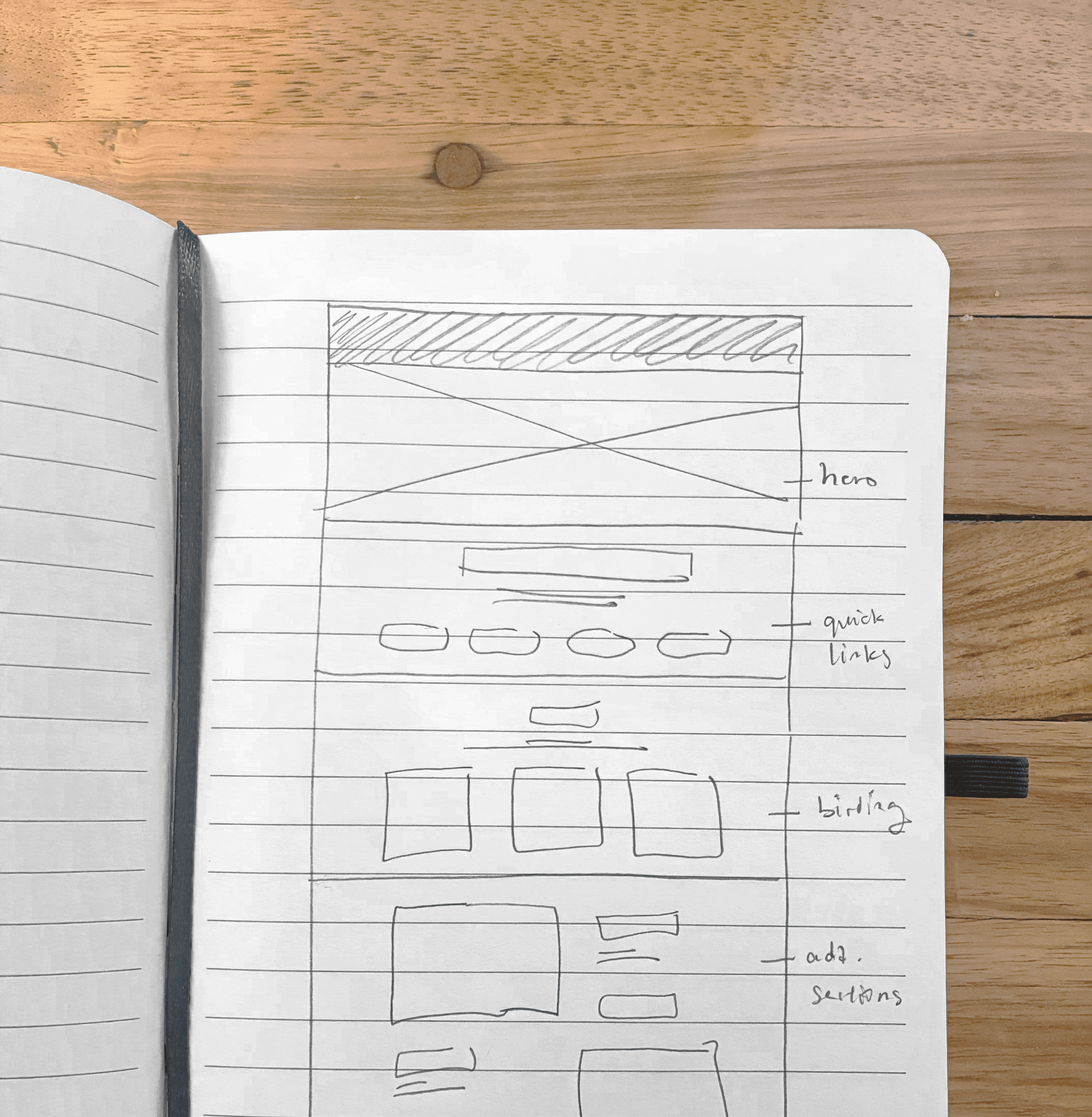
Using our new categories, we wireframed the new additional Birds landing page.
Card sorting helped reveal how users naturally group and label content, making it a useful tool for rethinking the Birds section’s information architecture.
Using our new categories, we wireframed the new additional Birds landing page.
PROTOTYPE
PROTOTYPE
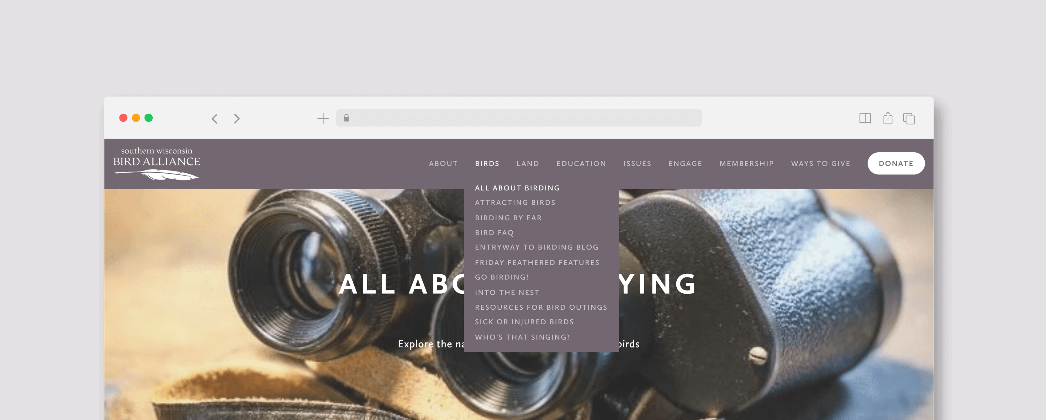
New and improved navigation bar
New and improved navigation bar
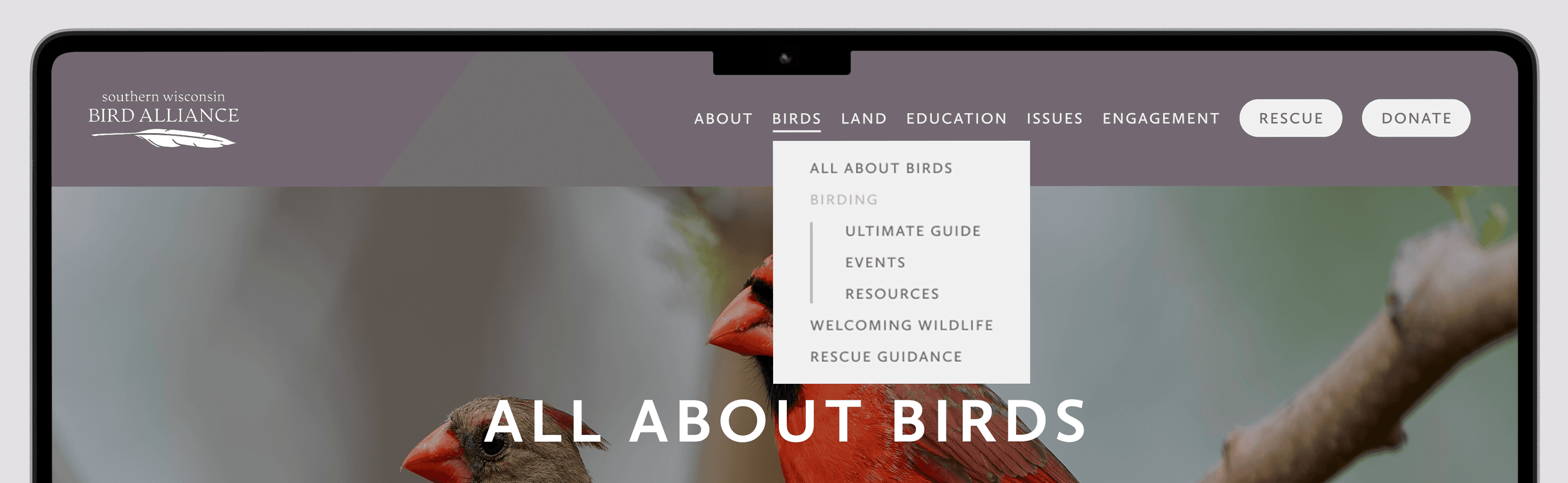
The new Birds tab now establishes a clear hierarchy without utilizing nested dropdowns.
We've also included a new, easy-to-find Rescue button for emergencies involving a hurt critter.
The new Birds tab now establishes a clear hierarchy without utilizing nested dropdowns.
We've also included a new, easy-to-find Rescue button for emergencies involving a hurt critter.
The Birds landing page
The Birds landing page
With the addition of a central hub, there's no more confusion about what content you're clicking on.
Here's how we ordered our freshly organized information for a complete experience.
With the addition of a central hub, there's no more confusion about what content you're clicking on.
Here's how we ordered our freshly organized information for a complete experience.
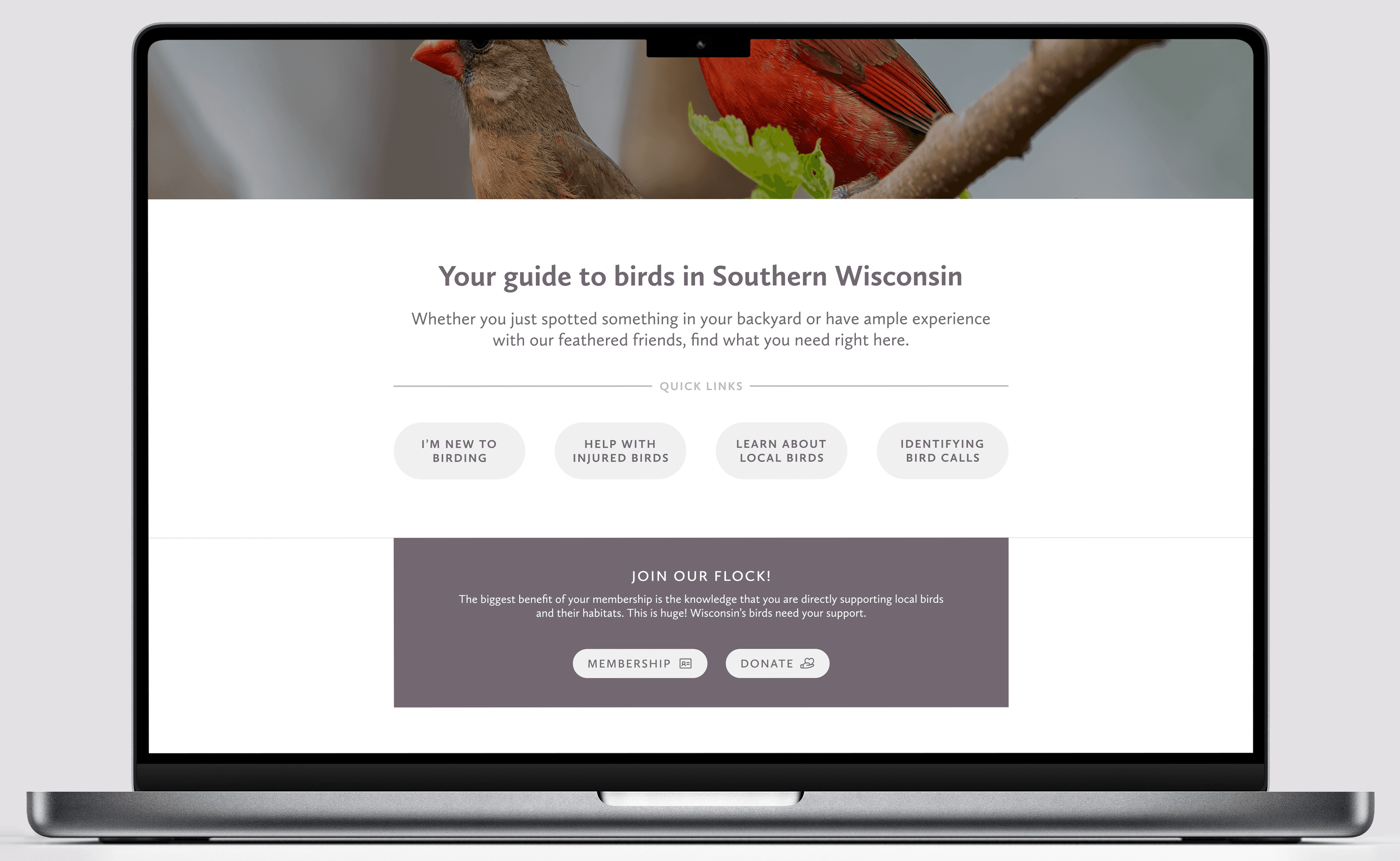
Quick links for easy access to popular topics, followed by a call to action.
Quick links for easy access to popular topics, followed by a call to action.
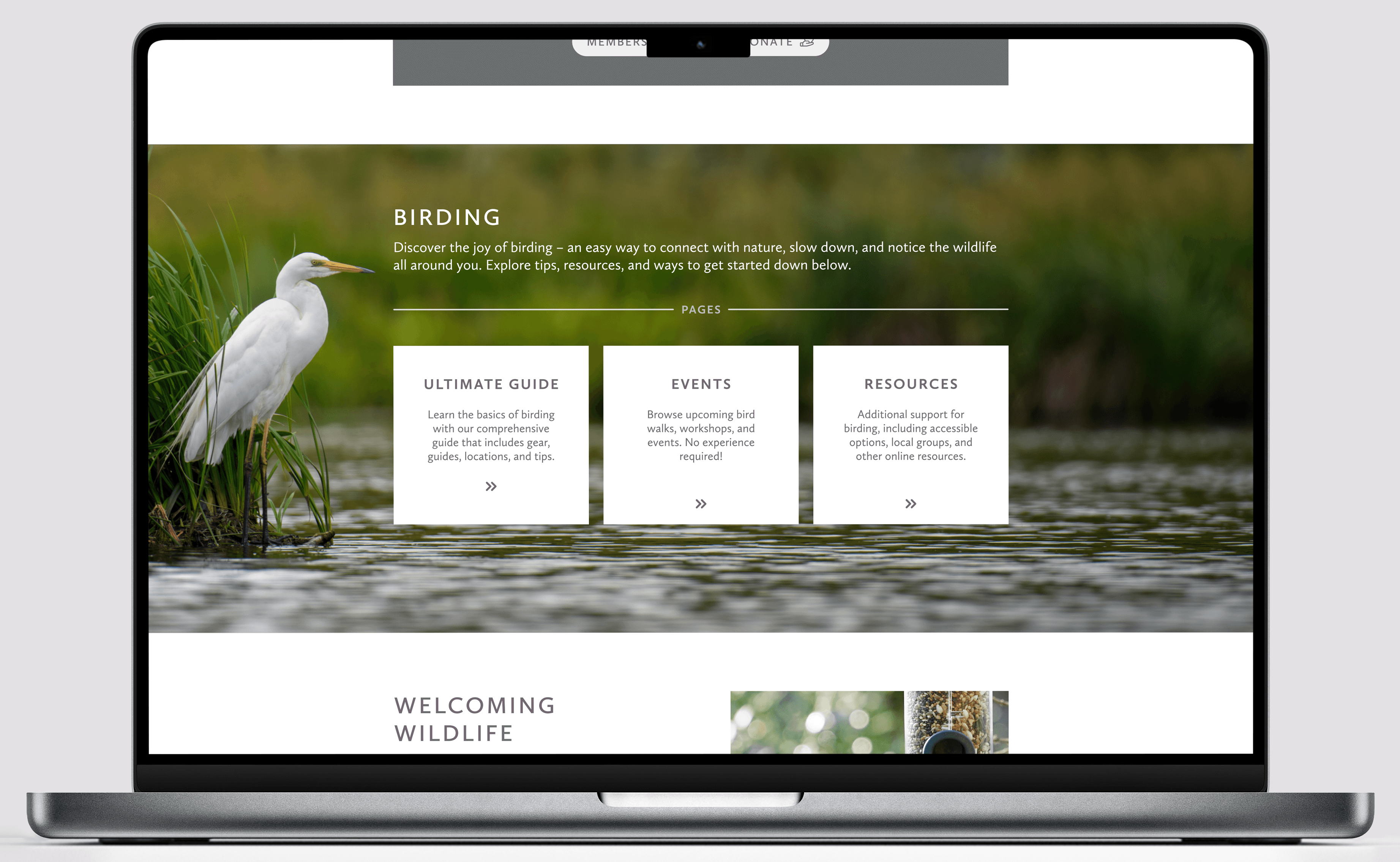
Highlighting birding as one of the most recurrent and important topics under the Birds tab.
Highlighting birding as one of the most recurrent and important topics under the Birds tab.
Giving additional informational pages their own sections.
Giving additional informational pages their own sections.
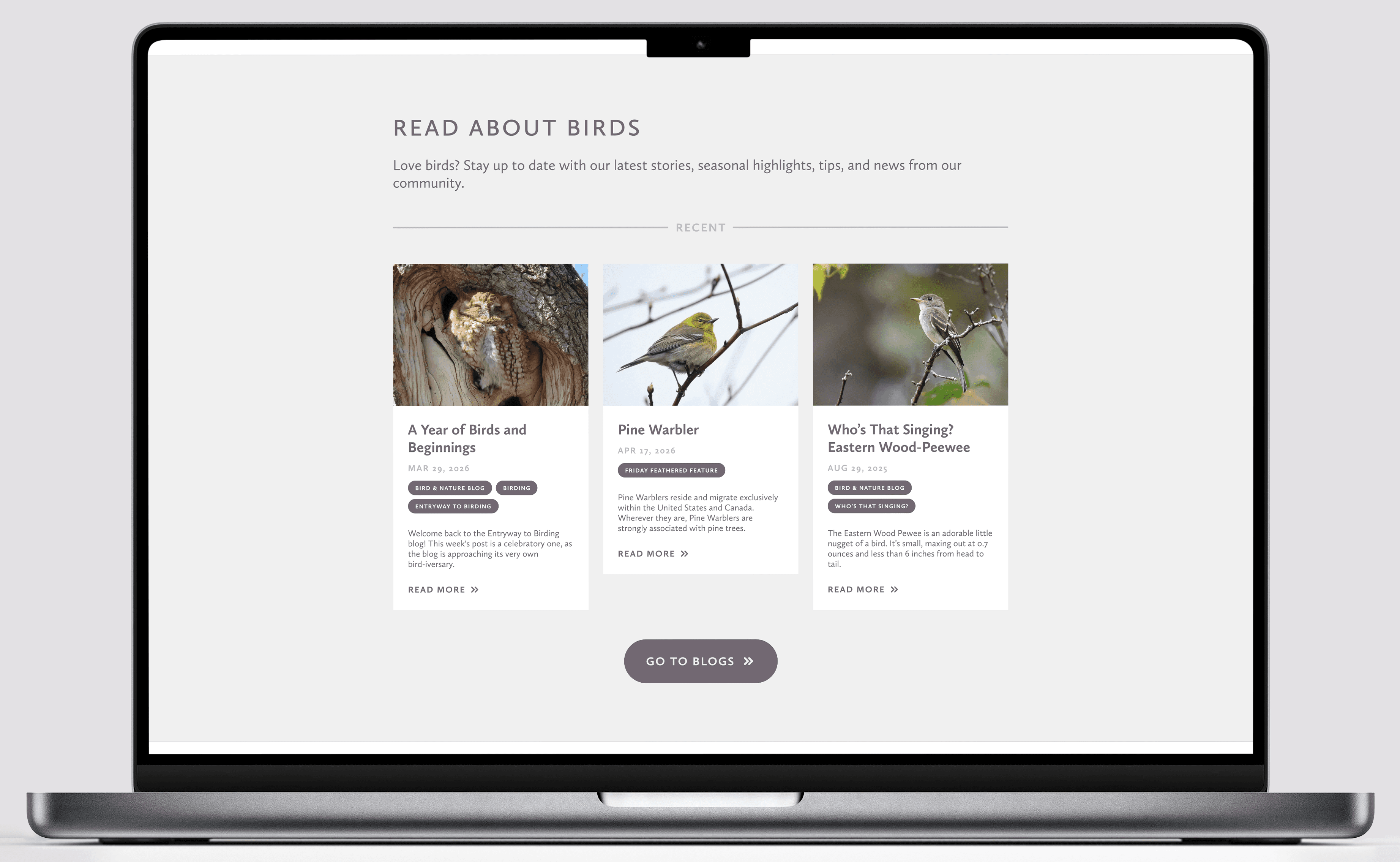
Blogs have been separated from the Birds tab, but users can be redirected to relevant articles.
Blogs have been separated from the Birds tab, but users can be redirected to relevant articles.
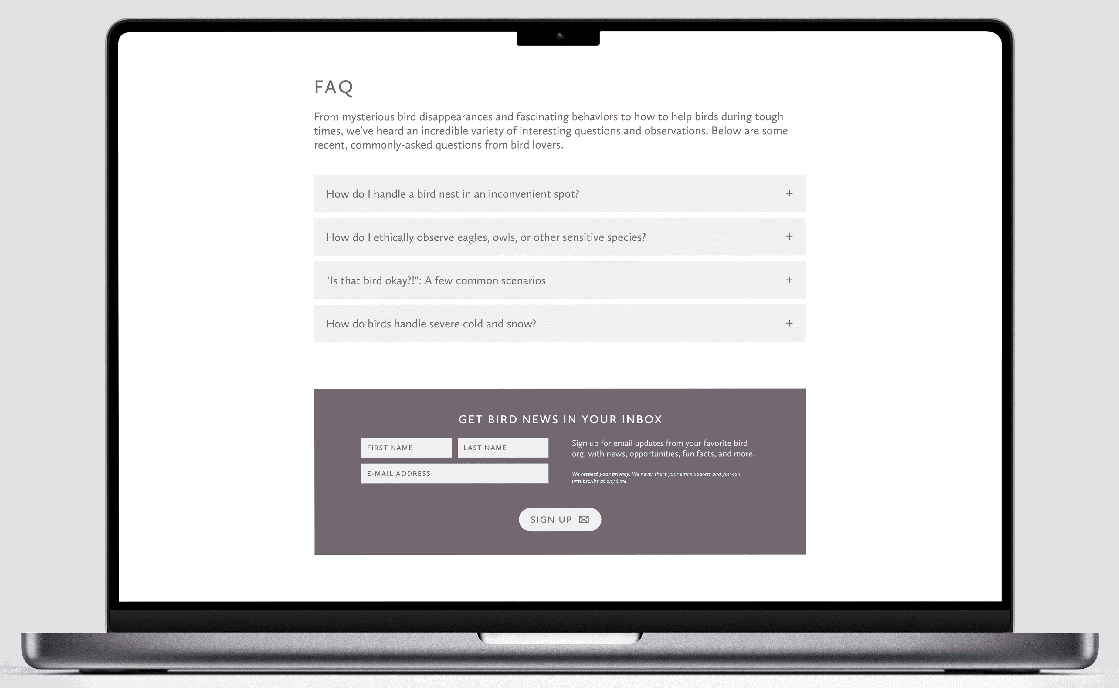
Finally, moved the brief FAQ to the main page, accordion style, complete with another CTA.
Finally, moved the brief FAQ to the main page, accordion style, complete with another CTA.
KEY TAKEAWAYS
KEY TAKEAWAYS
How we won Best Design Process
How we won Best Design Process
1
1
Project planning
Project planning
6 hours is a very short time frame to complete a process which usually takes weeks to months. We had to efficiently block out how long each part of the project would take, and which parts we wanted to give priority.
6 hours is a very short time frame to complete a process which usually takes weeks to months. We had to efficiently block out how long each part of the project would take, and which parts we wanted to give priority.
2
2
Feedback is crucial
Feedback is crucial
We were given the opportunity to consult researchers and designers that have had experience in the field. Without their help, we wouldn't have considered decisions crucial to our design, such as adding a Rescue button.
We were given the opportunity to consult researchers and designers that have had experience in the field. Without their help, we wouldn't have considered decisions crucial to our design, such as adding a Rescue button.
3
3
Understanding constraints
Understanding constraints
Taking the client and their limitations is just as important. Due to their use of Squarespace, our design had to work around nested dropdowns. Additionally, to present digestible changes, making sure not to deviate too much from the existing style was key.
Taking the client and their limitations is just as important. Due to their use of Squarespace, our design had to work around nested dropdowns. Additionally, to present digestible changes, making sure not to deviate too much from the existing style was key.